
Advertisements
Following the completion of the previous tutorial on Gutenberg WordPress, which involved creating a gallery section on the homepage, the next crucial step is learning how to create responsive header and footer for your website.
Having a responsive website is essential as visitors use various devices such as laptops, tablets, and mobile phones to access the internet.
By implementing responsive design, you can enhance the user experience across different devices. In this tutorial, we will focus on making the header responsive, resulting in the following final outcome:
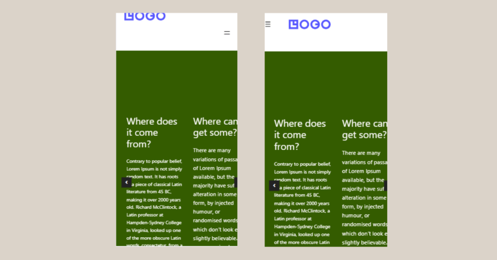
Transforming a non-responsive header (left) into a responsive header (right) using the Gutenberg WordPress editor.
To achieve this, there are several steps to follow in order to make both the header and footer of your website responsive. Here’s the complete guide:
Advertisements
How to Create Responsive Header & Footer on WordPress
To learn how to create responsive header & footer using Gutenberg, the first step is installing responsive plugin, creating responsive header, and configure the responsive header & footer.
Step 1: Install Responsive Plugin
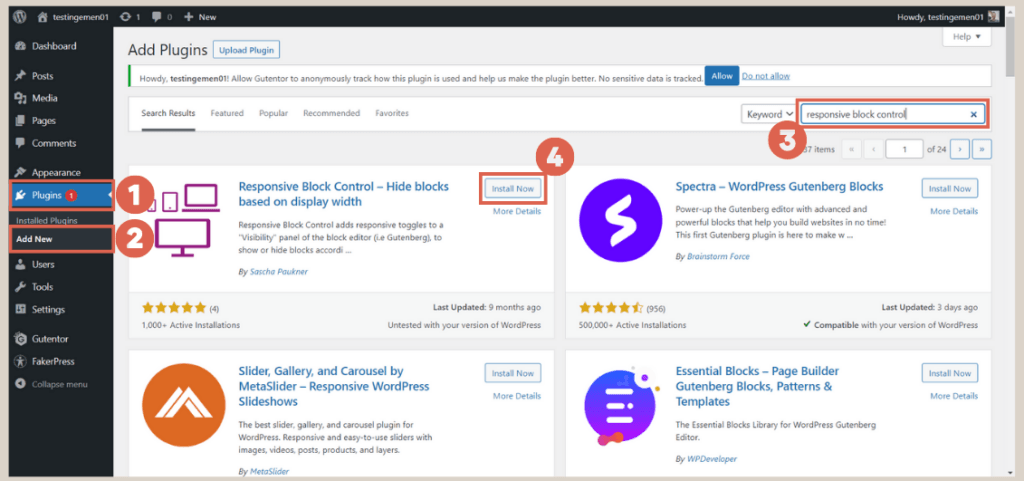
To create a responsive header on your website using Gutenberg, the initial step involves downloading and installing a responsive plugin. Follow these instructions to install a plugin in WordPress:
- Access the WP Admin page and click on Plugins, then select Add New.

- In the plugin search box, type responsive block control.
- Click on Install Now for the Responsive Block Control plugin.
After successful installation, you will need to create a separate header for the mobile version.
Advertisements
Step 2: Create Mobile-Responsive Header
The mobile-specific header is added below the existing header, without deleting the existing one. Follow these steps to add a custom header for mobile:
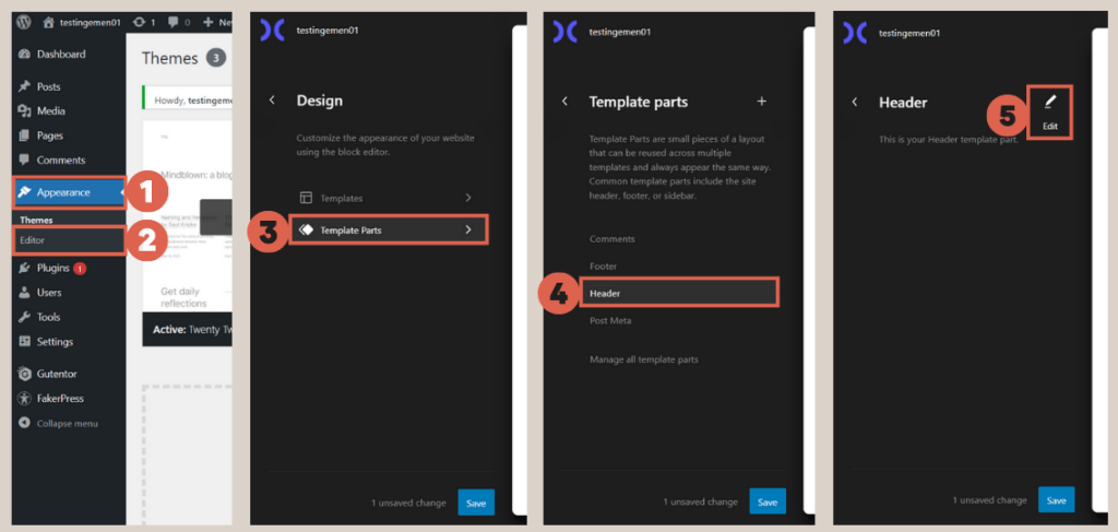
- Click on Appearance > select Editor > then choose Template Parts > click the Header option > click the Edit icon.

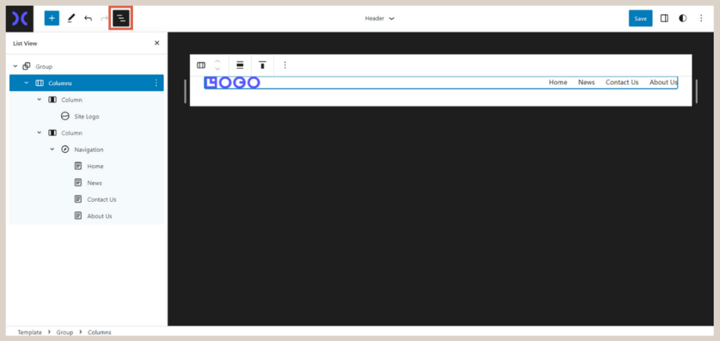
- Open the List View to ease the settings configuration.

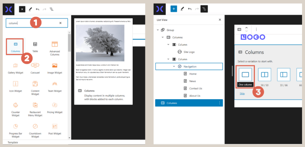
- Click on [+] to add a block, and type column in the block search box > select Columns > choose the One column option to insert a single column.

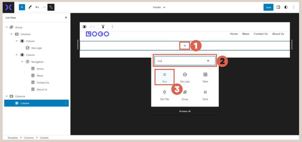
- Next, click on [+] and type row in the block search box > choose the Row block.

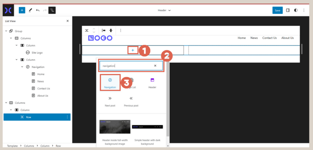
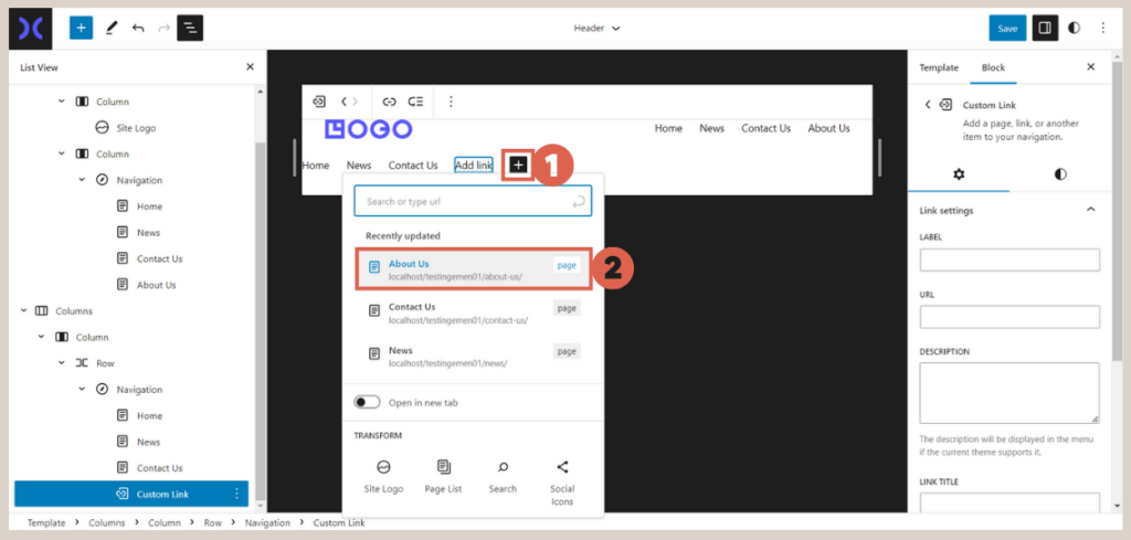
- Click on [+] again > type navigation in the block search box > select the Navigation block to add navigation buttons.
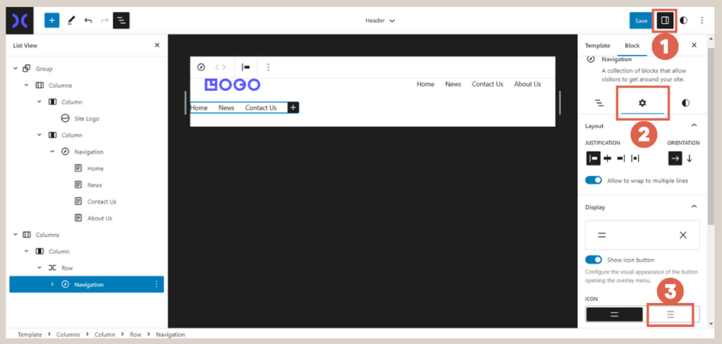
- Go to Settings > select Setting. In the ICON section, choose the 3-bar icon to create a hamburger menu.

- If the navigation menu is not sufficient, click on [+] in the navigation block > select the desired menu to add.

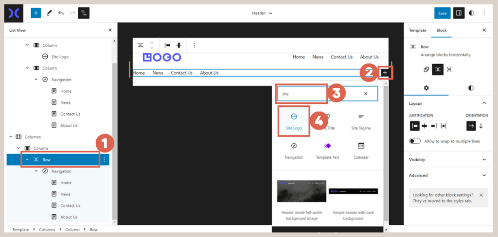
- Now, click on the Row block, and then click on [+] > type site in the block search box > select the Site Logo block to add the website logo.
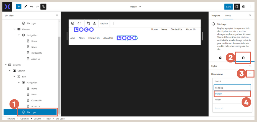
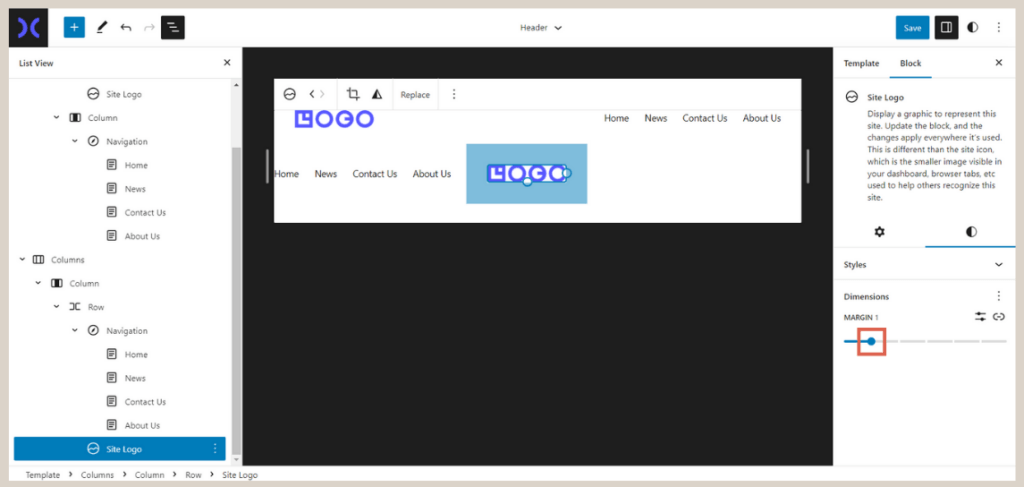
- Click on the Site Logo block > then click on Style in the settings column > click on the [+] in the Dimensions menu and select Margin.
- Adjust the Margin according to your requirements. We are using a margin size of 1.
Once the navigation menu and site logo are created, proceed to set the header’s visibility for both desktop and mobile views.
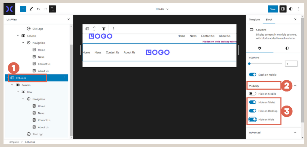
Step 3: Configure the Responsive Header
Setting up a responsive header involves managing visibility settings, which determine which blocks are displayed on specific devices. Follow these steps to configure the responsive header:
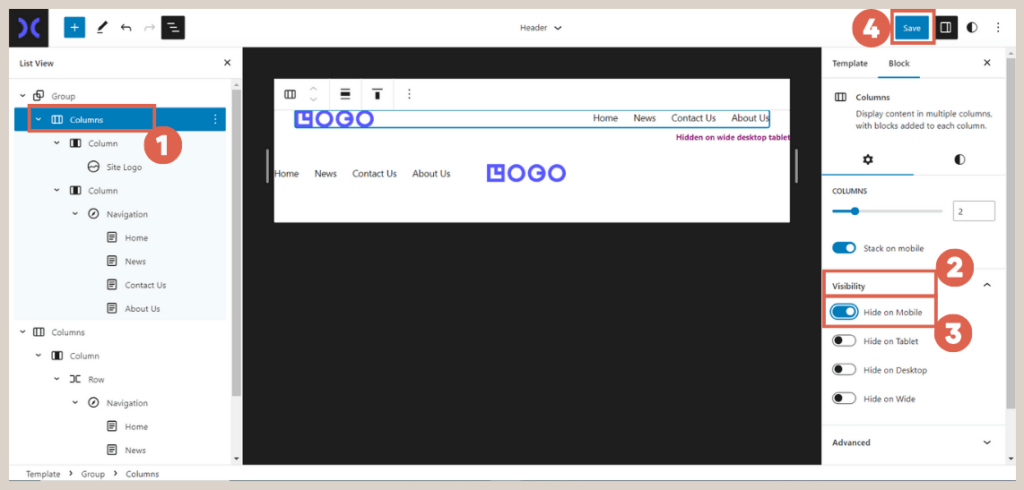
- Click on the previously created Columns block. In the Settings menu on the left, click on Visibility. Activate the toggle switches for Hide on Tablet, Hide on Desktop, and Hide on Wide.

- Click on the upper Columns block > then click on Visibility in the Settings section > activate the toggle switch for Hide on Mobile.

- Once you have finished configuring the settings, click Save.
At this stage, the responsive header is now fully created. To view the final result of the responsive header, open your website’s front-end and press Shift + Ctrl + C. Select the Mobile view to see how the header appears on different devices.
Advertisements
Step 4: Configure the Responsive Footer
Assuming you have successfully created a footer using Gutenberg and employed the Advanced Column block, which is a crucial feature in Gutentor.
If you utilized the Advanced Column block, your footer is automatically responsive. However, you can further customize it with the following steps:
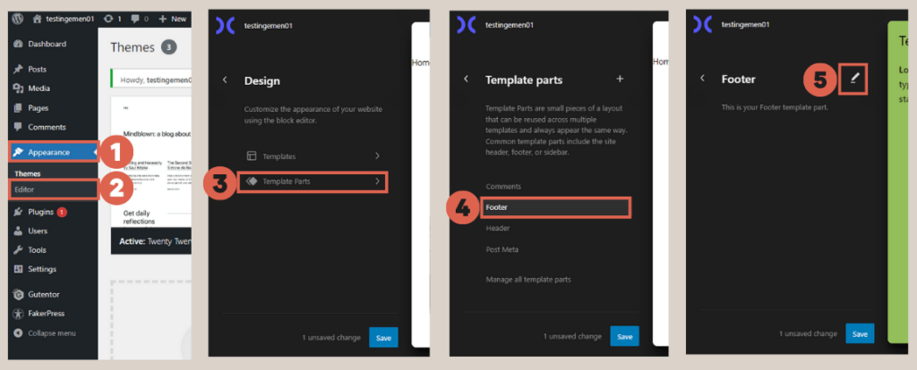
- Click on the Appearance menu > select Editor > navigate to Template Parts > choose Footer. Then, click on the Edit icon.

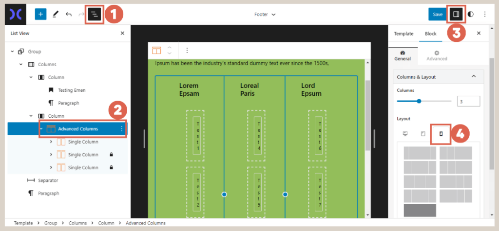
- On the editor page, click on List View > select the footer navigation with Advanced Columns > click on Settings > in the Layout section, click on the Mobile icon. Choose your desired settings; for instance, we will choose one column.

- Done! When you view the website on a mobile device, the footer will be responsive.
Advertisements
Conclusion
In this tutorial, we have learned how to create responsive header and footer using the Gutenberg WordPress Editor. The next step is to apply the responsive feature to the slider, as explained in tutorial number 5.
If you prefer to avoid the hassle of website creation, you can entrust the task to Tonjoo Team, a professional website developer trusted by various individuals.
Feel free to discuss your website ideas and requirements through Contact Tonjoo, and we will be delighted to bring them to life!
Feel free to get in touch with us to discuss further and create a website that perfectly suits your business needs!
Last Updated on July 18, 2024 by Tonjoostudio Team

Advertisements