Advertisements
In the previous Gutenberg WordPress tutorial, you successfully created a responsive slider. Now, let’s learn how to create responsive client logo section on the Homepage.
Ensuring responsiveness is essential to adapt the logo display to various user devices. This way, the logos remain clear and visible even when viewed on mobile devices.
After completing this tutorial, you will be able to customize the appearance of the client logo section on mobile devices, as demonstrated in the comparison below:
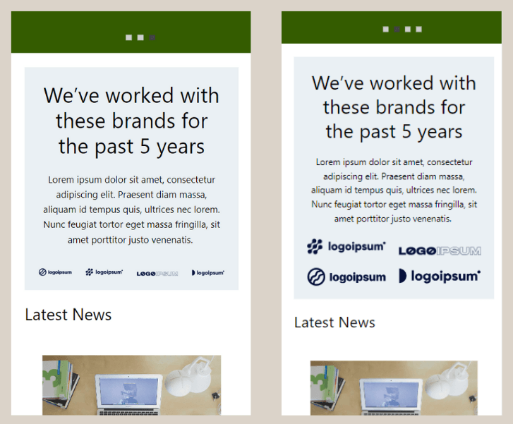
Non-responsive client logo section (left) and responsive client logo section (right).
The process of creating a responsive client logo section can be divided into two steps: (1) organizing the logos into separate groups, and (2) ensuring the existing logos within the groups are responsive.
Advertisements
Step 1: Organize the Logos into Groups
To initiate this step, we’ll convert the existing logos into a Group block. Utilizing the Group feature allows for collective management of client logos and ensures their responsiveness on the Homepage.
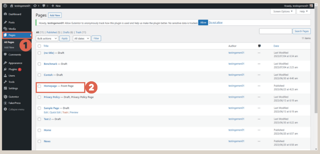
- Navigate to the WP Admin page, access the Pages menu > select the previously created Homepage.

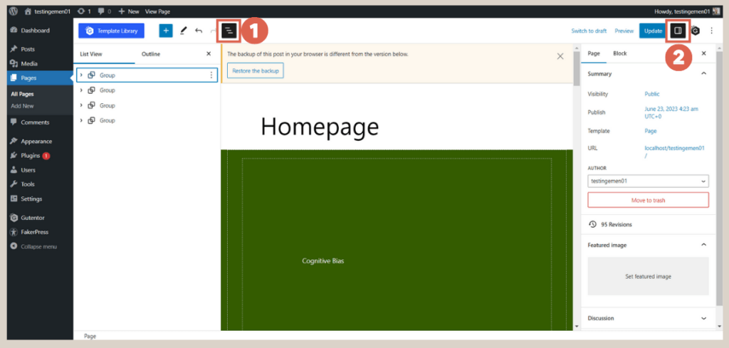
- Open the List View on the left side and the Settings on the right side to streamline the settings process.

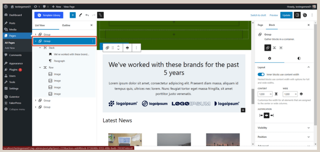
- Within the List View, locate the Group block that contains the client logos or partner section.
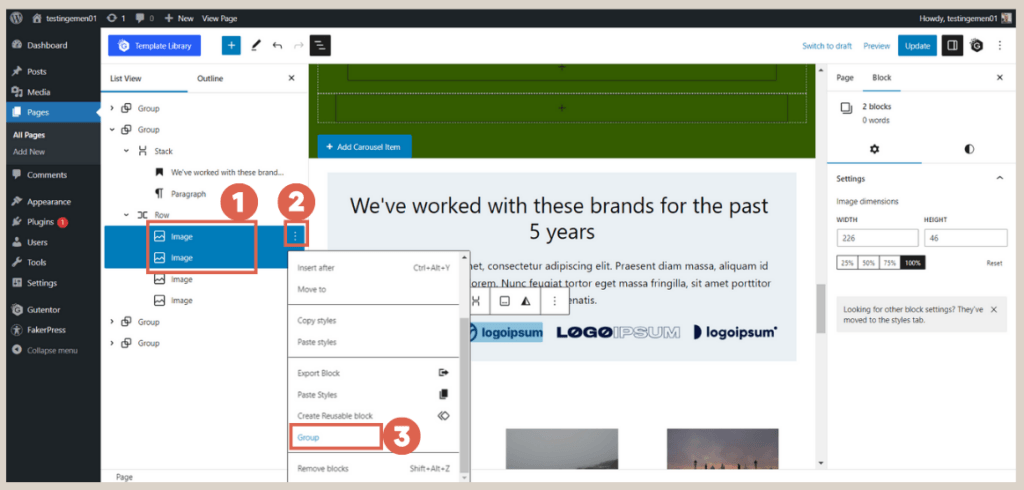
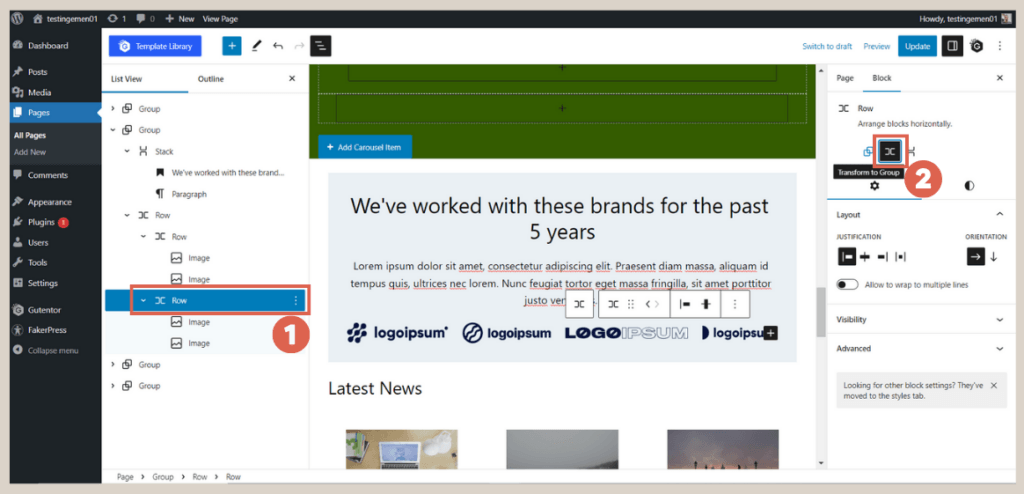
- Select two Image blocks for the client logos via the List View > click the three dots > choose the Group option.

- Repeat the same process for the remaining two logos.

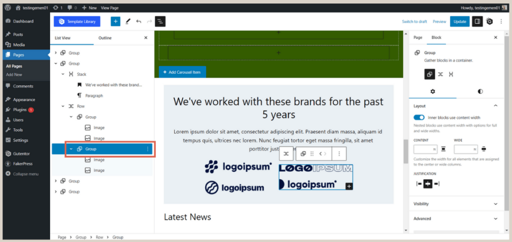
These steps apply to scenarios with four logos in one section. If you have more than four logos, you can adjust the organization accordingly. For instance, if there are six logos, you can divide them into two or three groups.
Step 2: Achieve Responsive Logos in Logo Group
In this subsequent step, you will make the logos responsive without the need for any additional plugins.
By utilizing the inherent features of the Gutenberg editor in WordPress, specifically the Allow to wrap multiple times option, we can easily achieve responsiveness. Follow these steps:
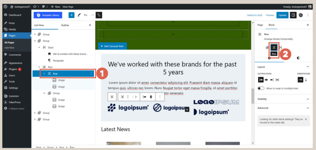
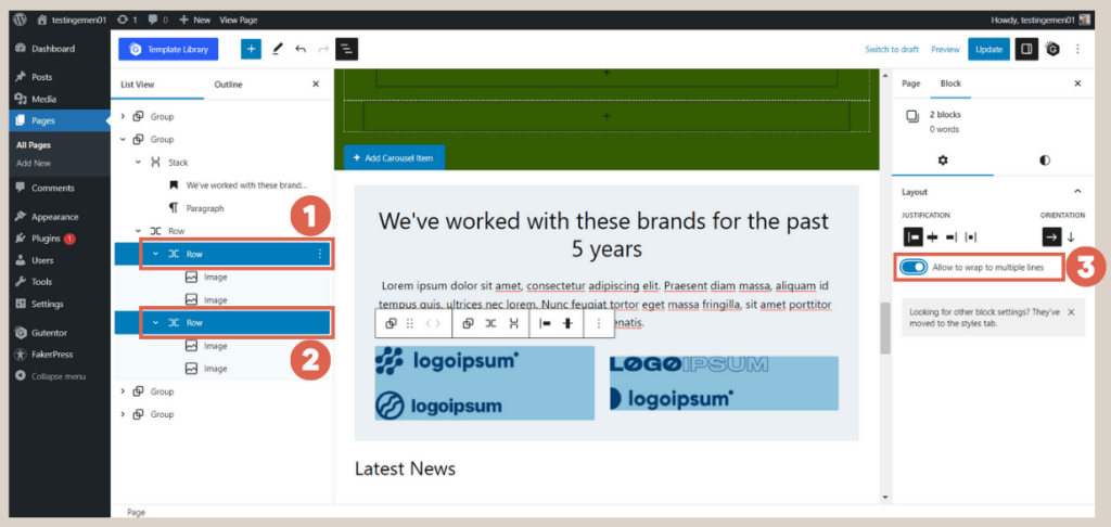
- Select one of the logo groups, then access the Settings section on the right-hand side and change the Group to Row.

- Repeat the process for the next Logo Group.

- Select all the Row blocks that contain the logos together (hold the Shift key + click the Row blocks) and enable the Allow to wrap to multiple lines toggle in the Settings.

- That’s it! You can now preview the results on the front-end by clicking Update first and then Preview.
Important Note:
Ensure that both Group blocks, each containing a logo, have been converted to Row blocks as mentioned in Step 1. If this step is overlooked, the Allow to wrap to multiple lines feature will not be available.
You can check the desktop version and mobile version as depicted in the images below. To view the mobile version, press the Shift + Ctrl + C key combination on your keyboard.
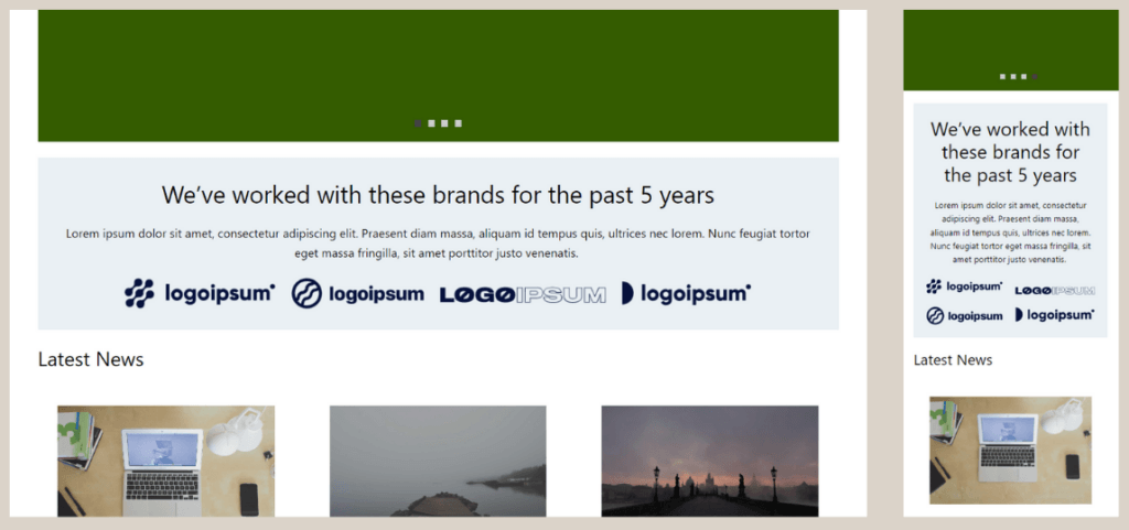
Example of client logo section that has been responsive. The left side is a view from desktop, and the right sider is a view from mobile.
Advertisements
Ready to Create Responsive Client Logo Section?
In conclusion, this tutorial covered the process on how to create responsive client logo section using Gutenberg, allowing the logos to adapt to different screen sizes of users’ devices.
Having achieved responsive client logos, the next step will involve making the list post and gallery sections on the Homepage responsive as well.
Creating a fully functional and responsive website with well-designed elements can be a complex task. If you seek a professional team to handle these aspects, Tonjoo’s team is the ideal choice.
With a proven track record in developing websites for local and international clients, such as Polygon and Unilever, we ensure excellent responsiveness and functionality.
To bring your website ideas to life, let’s discuss your requirements through our contact at Tonjoo, and we will be delighted to assist you!
Last Updated on July 18, 2024 by Tonjoostudio Team

Advertisements