
Advertisements
After successfully setting up the responsive header and footer, you need to learn how to create responsive slider, ensuring your website caters to mobile users.
Before delving into the slider setup, it’s essential to customize your homepage, including background and typography settings.
Once these initial steps are complete, proceed to configure the responsive slider, following the provided table of contents for guidance.
Advertisements
How to Create Responsive Slider using Gutenberg WordPress
There are four major steps to turn regular slider into responsive one using Gutenberg editor. Here they are!
Step 1: Set Up Homepage
Upon accessing the front-end homepage, you may notice that the previously created homepage is not displayed. Instead, you may encounter a layout similar to the one shown below:
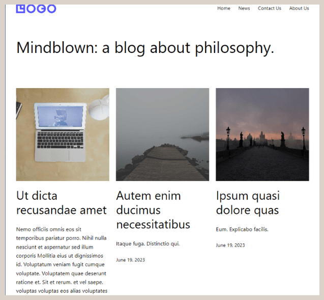
The Homepage before it is set up.
In Gutenberg WordPress, the homepage is not automatically set as the default front page because WordPress relies on static settings to determine the site’s homepage.
To set the created homepage as the landing page, follow these steps:
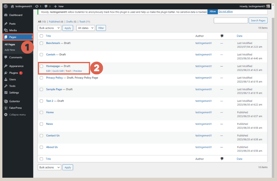
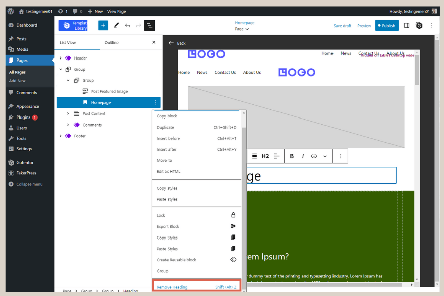
- Click on the Pages menu> select the Homepage that was created earlier in the WordPress slider tutorial.

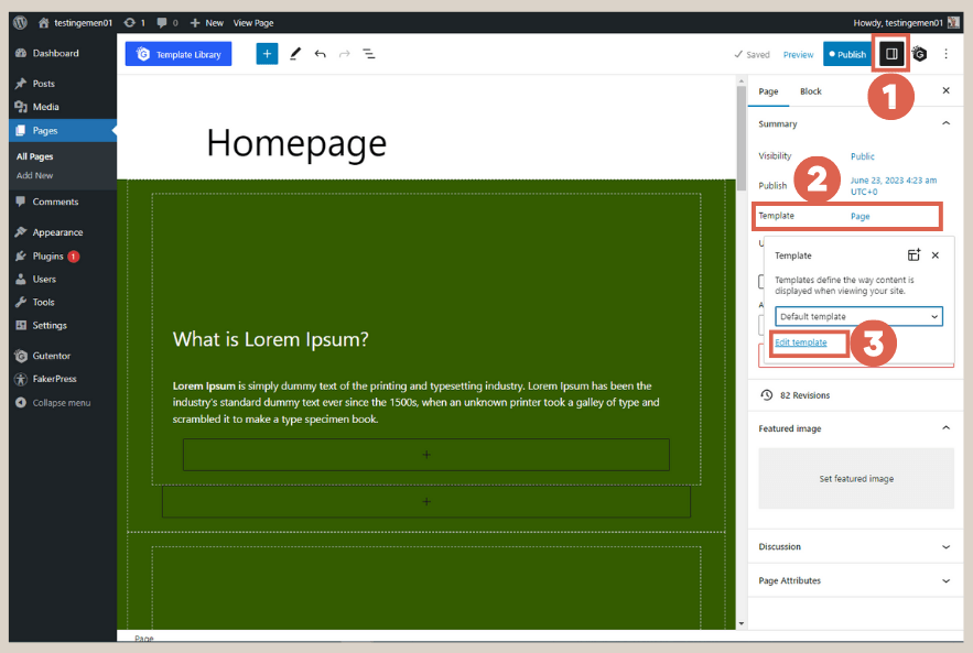
- On the Homepage editor page, click on Settings in the top right corner > choose the Template option, and finally click on Edit template.

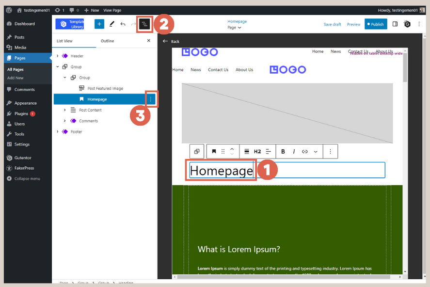
- Click on the text Homepage > open the List View > click on the three dots.

- Select Remove Heading to delete the text block.

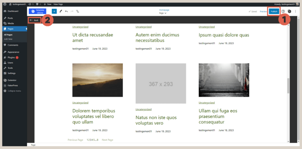
- Click on Publish > then click Back to exit the template editor.

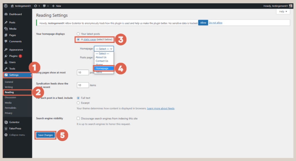
- In the WP Admin menu, select Settings > then go to Reading > under Your homepage displays, choose A static page, > for the Homepage option, select Homepage. Finally, click Save Changes.

After completing these steps, when you visit the website’s main page, the created Homepage will now be displayed, appearing similar to the following:
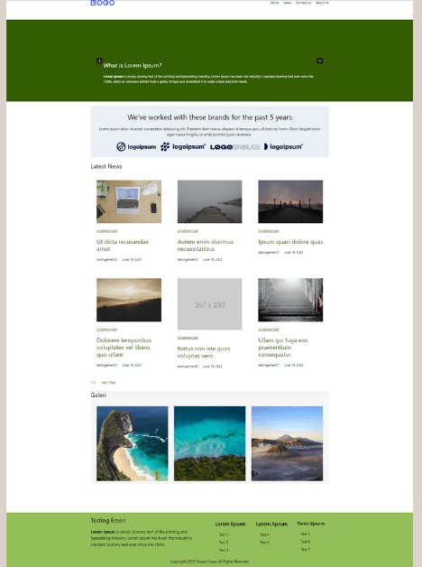
Creating responsive slider on the homepage.
Advertisements
Step 2: Configure Slider (Carousel) Background Settings
In the next step, you can customize the background color for the slider, although it does not heavily influence the responsive features.
To configure the background, navigate to the Pages menu > select the Homepage as you did previously. Then follow these steps:
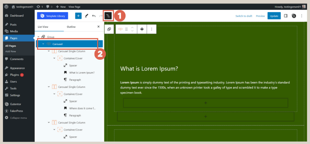
- Open the List View, and click on the Carousel block.

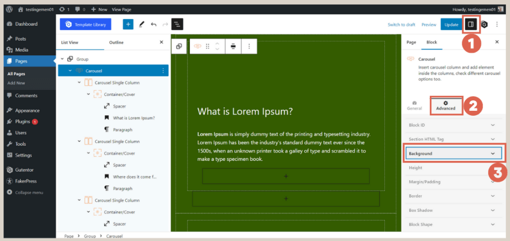
- Click on Settings in the top right corner > choose Advanced > select Background.

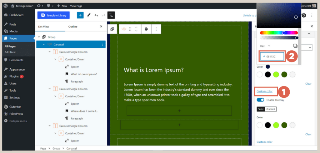
- Click on Custom color > adjust the background color according to your preferences.

Step 3: Configure Typography for the Slider
Before proceeding to create a responsive slider, it’s essential to ensure that the typography settings for the slider are properly configured. To set the typography, follow these steps:
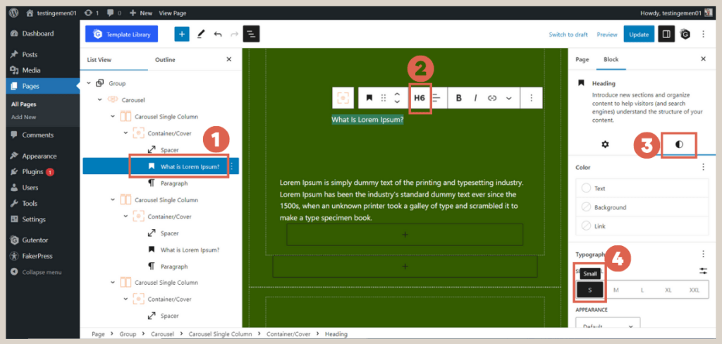
- In the List View on the left side, click on the Heading of one of the Carousel Single Column blocks > change the heading to H6. In the Settings column, go to Styles > under Typography, select the Small (S) size.

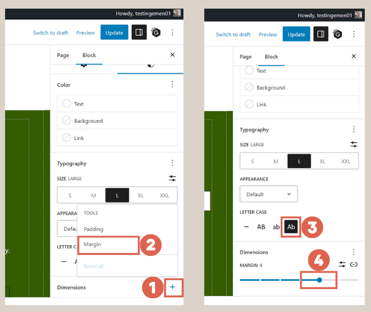
- Scroll down and click on the [+] sign in the Dimensions section > choose Margin > under Letter Case, select Ab. Then, adjust the margin size to 4.

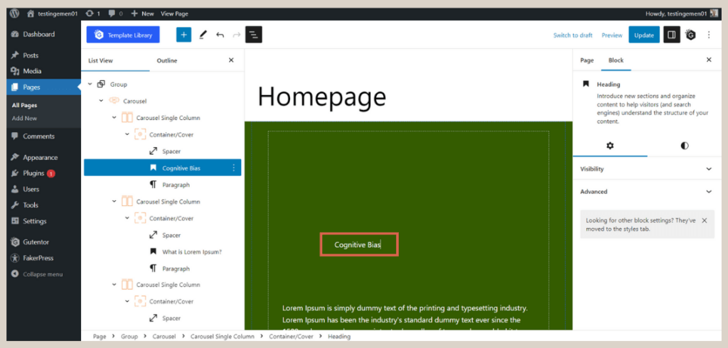
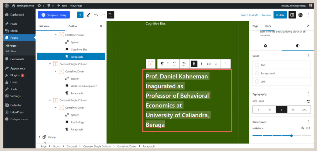
- Modify the text in the heading according to your requirements. For instance, you can fill in Cognitive Bias.
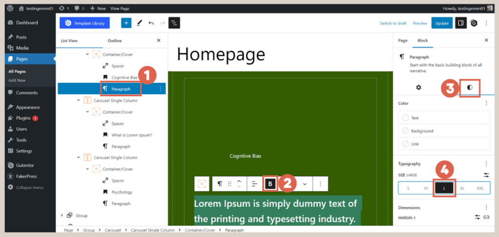
- In the List View, select the Paragraph block > make the text Bold. In the Settings, click on Styles > change the Typography size to Large (L).

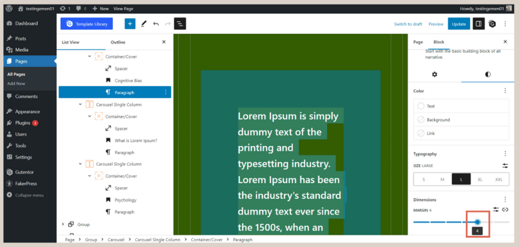
- Next, change the Margin to 4.

- Once done, fill in the Paragraph block with the desired text. For example, you can enter Prof. Daniel Kahneman Inaugurated as Professor of Behavioral Economics at University of Caliandra, Beraga.
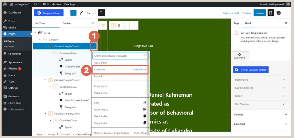
- Select the Carousel Single Column block that you edited, then click on the three dots, and choose Duplicate twice so that you don’t have to redo the settings. The old Carousel Single Column block can be deleted.

You can now fill in the duplicated second and third sliders. Once completed, these sliders can be made responsive.
Advertisements
Step 4: Creating a Responsive Slider for Mobile and Tablet
To make the slider responsive, follow these steps:
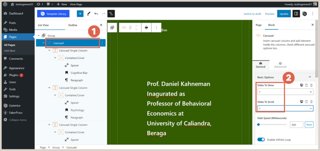
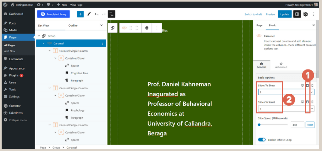
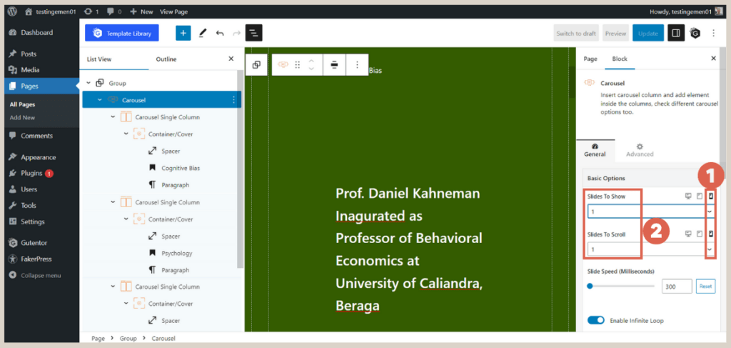
- In the List View, select the Carousel block. In the Settings section, ensure that the Slides to Show and Slides to Scroll options are both set to 1.
- Next, click on the Tablet icon in the Basic Options and change the Slides to Show and Slides to Scroll to 1. This setting ensures responsiveness on tablet devices.

- Click on the Mobile icon in the Basic Options > change the Slides to Show and Slides to Scroll to 1. This setting ensures responsiveness on mobile devices.
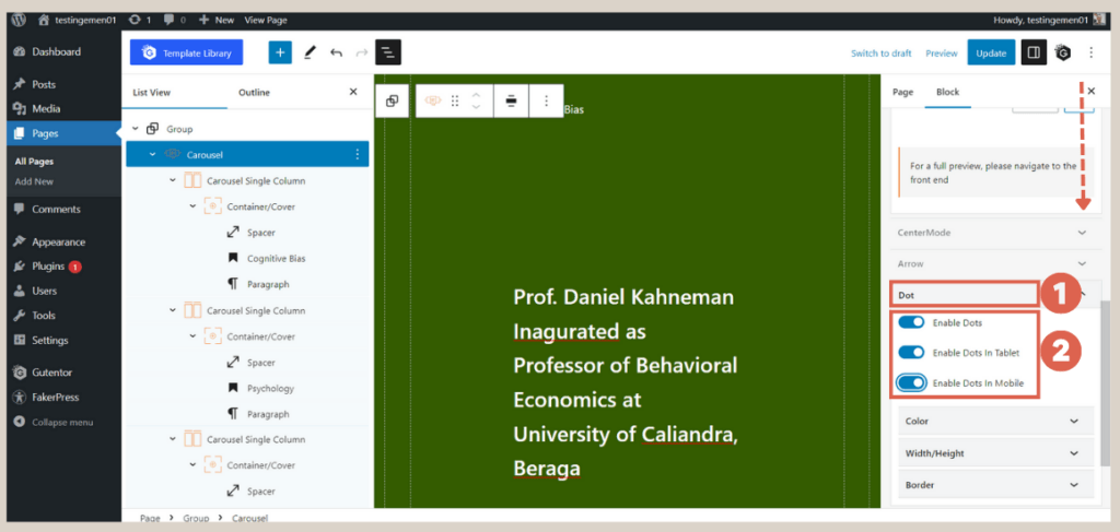
- Scroll down and click on the Dot section. Enable all the toggles: Enable Dots, Enable Dots in Tablet, and Enable Dots in Mobile. This setting displays dots at the bottom of the slider.
Finally, publish the changes and preview the results on the front-end.
Advertisements
Conclusion
That sums up the tutorial on how to create responsive slider using WordPress Gutenberg editor. Next, you should make the list of posts and the gallery responsive as well.
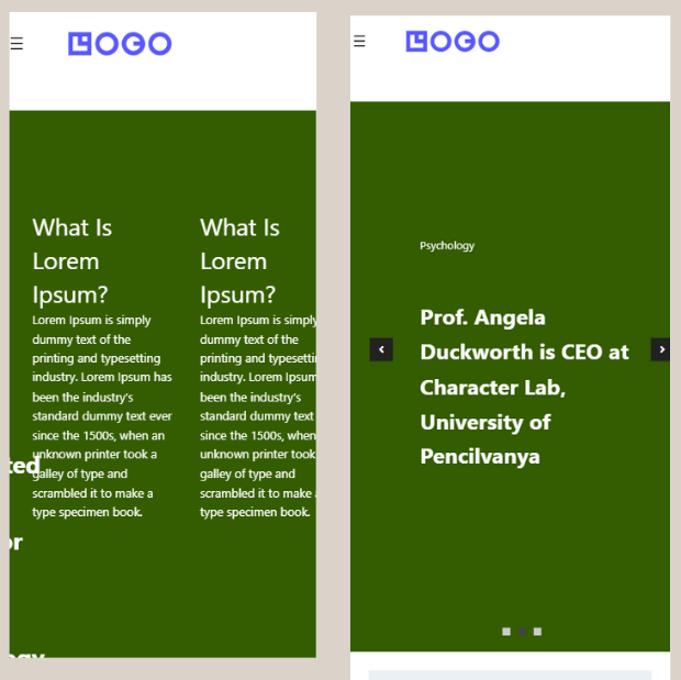
Here is a comparison of the homepage’s appearance on mobile, before and after making it responsive. Additionally, don’t forget to make the client logo section responsive.
However, website creation can be time-consuming. Don’t let the task of creating a well-designed website hinder your business.
You can trust your website needs to the Tonjoo Team, a professional software development company experienced in handling both start-up and multinational company websites.
Let’s discuss your ideas and website requirements through our contact information to bring your ideal website to life!
Last Updated on July 18, 2024 by Tonjoostudio Team

Advertisements