Advertisements
Having successfully applied the technique for responsive client logos, the last crucial task to ensure a mobile-friendly homepage is learning how to create responsive post list and gallery sections.
The List Post section showcases a collection of blog posts, while the Gallery section provides an attractive display of images for users.
Before proceeding, it is assumed that you have already practiced the tutorial on creating the post section and gallery section on the homepage. If you have accomplished that, follow the steps below!
Disclaimer:
Please note that the List Post section we previously created is already responsive. However, in this section, we will learn how to further customize the post list and update individual posts. On the other hand, the Gallery section still needs responsive adjustments.
Advertisements
Step 1: Customize List Post Components
In the initial step, we focus on configuring the List Post components, specifically editing the Post Title block and the Categories block with desired colors, along with exploring other available components.
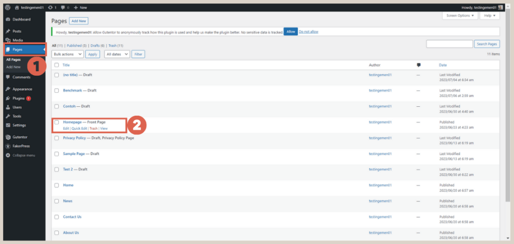
To get started, access the WP Admin page and follow these instructions:
- Click on the Pages menu in WP Admin > select the Homepage.

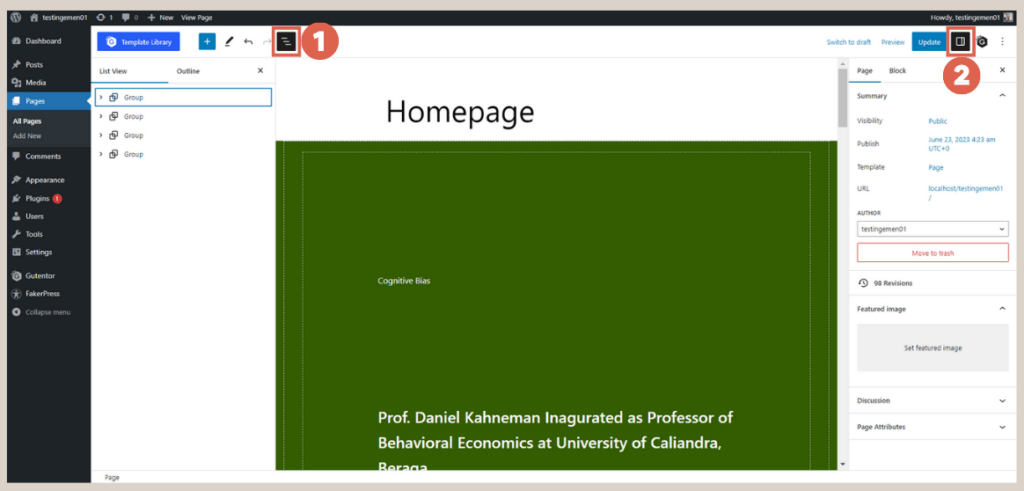
- Open the List View on the left side and the Settings on the right side to simplify the configuration process.

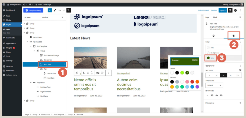
- Choose the Group block that contains the list post.
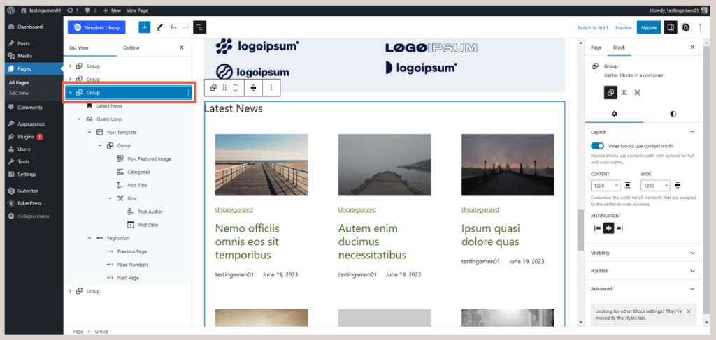
- Access the Post Title block > go to the Settings section, and click on Style. Change the Link color as needed (e.g., we used color code 345C00).

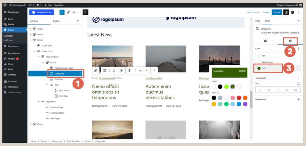
- Repeat the same procedure for the Categories block.
Step 2: Update Single Posts
Next, proceed to update the titles and featured images that were previously generated by FakerPress during the tutorial for creating a simple page, particularly the header creation. Follow these steps:
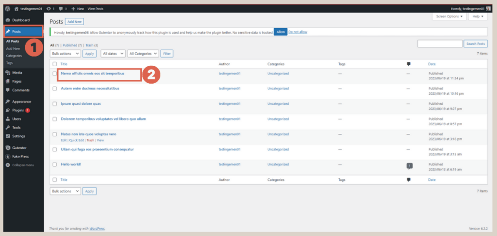
- Access the WP Admin page and click on the Posts menu > choose one of the single posts you wish to edit.

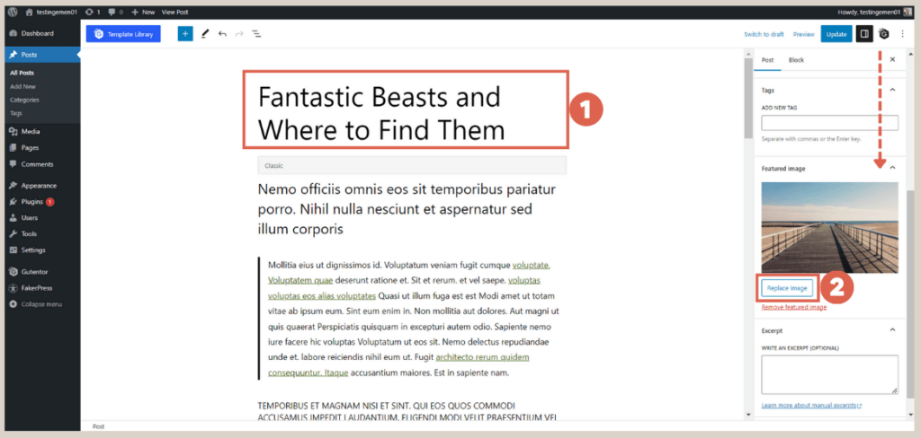
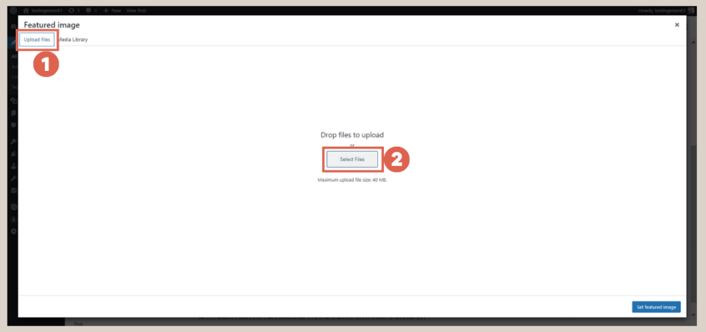
- Modify the Post title section > in the Settings, scroll down to the Featured image > click on Replace image.
- Choose Upload files > click on Select Files > upload the provided dummy featured image.

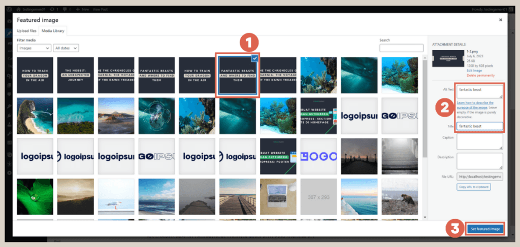
- Select the desired image > enter the Alt Text and Title for the image > and click on Set featured image.
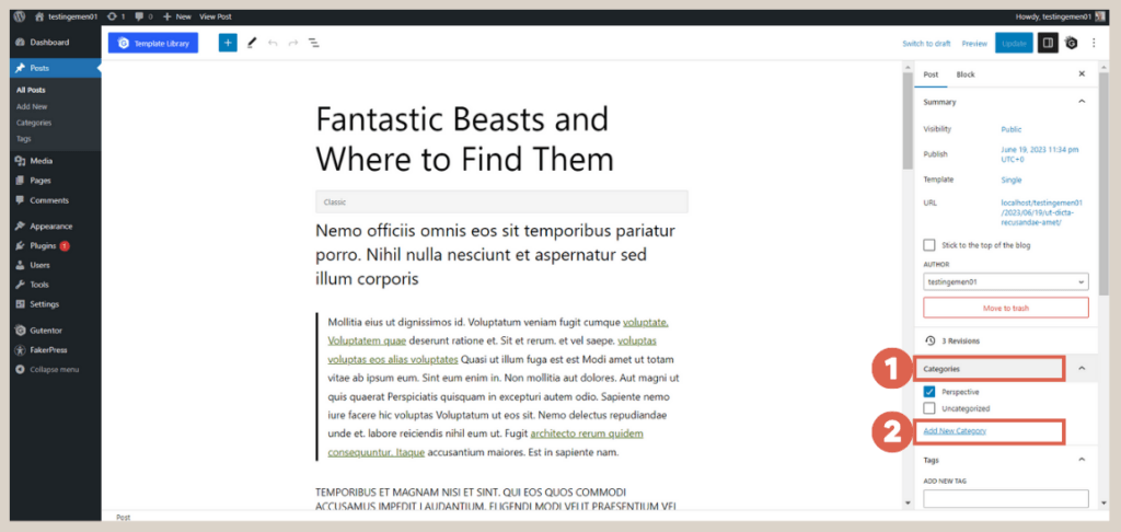
- In the Settings section, scroll up > click on Categories > use the Add New Category option to add categories as needed, which allows you to group content.

- Once completed, click on Update.
- Repeat the same process for all single posts.
After updating all the single posts, you can preview the final result on the front-end.
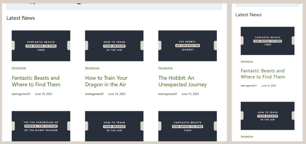
Final result of responsive post list section on desktop (left) dan mobile (right).
Advertisements
Step 3: Make the Gallery Responsive
After completing the post list section, the next step is to ensure that the gallery section is responsive. Follow these steps:
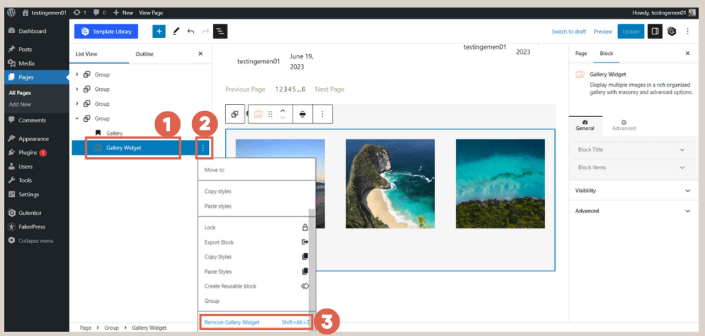
- Firstly, remove the previously created block by clicking on the Gallery Widget block > click on the three dots > select Remove Gallery Widget.
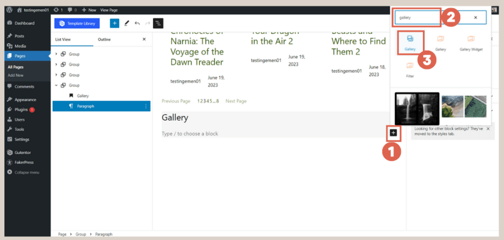
- Next, add a new block below the Gallery heading block by clicking on [+] > typing gallery in the search box > then, select the Gallery feature.
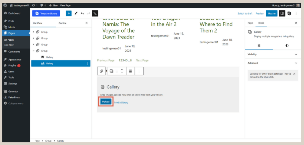
- Click on Upload and select the provided images from the available files.

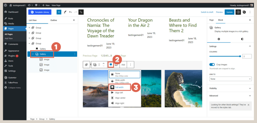
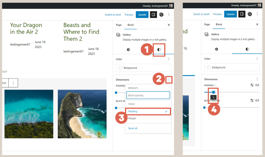
- In the List View on the left, click on the Gallery block > in the toolbar that appears on the heading, click on the size settings > then, select Full width to ensure the gallery spans the entire width of the screen.
- In the Settings section, click on Style > under the Dimensions section, click on the three dots > choose Padding > set the padding to 1 to adjust the spacing between images.

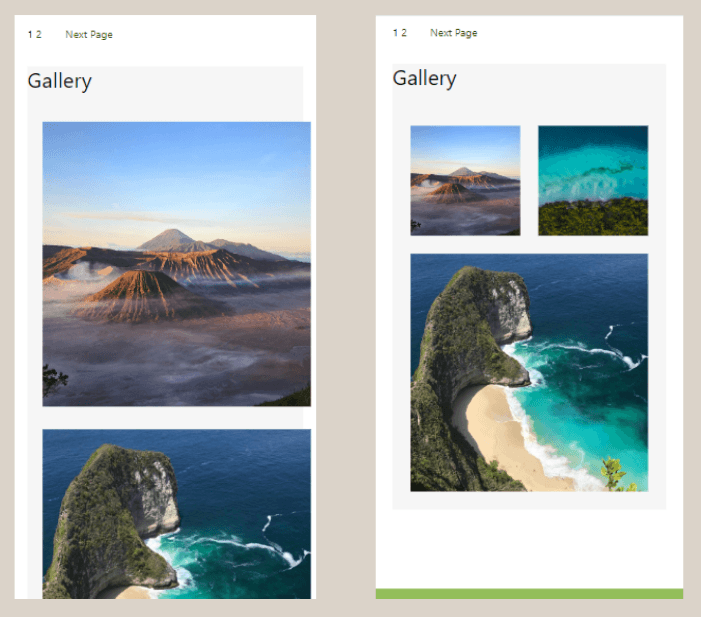
- That’s all! The images in the gallery will now automatically adapt to the user’s screen size, providing a responsive user experience. Refer to the image below for guidance:

Conclusion
This concludes the tutorial series on how to create responsive post list and gallery using the Gutenberg WordPress editor. If you wish to start from the beginning, you can refer to the tutorial on how to create a header.
While the Gutenberg editor provides a solid foundation for webpage creation, further customization is essential to achieve a professional and polished appearance.
For an elegant website that combines excellent functionality and robust security, our dedicated development team at Tonjoo is here to cater to your needs.
We boast a wealth of experience in designing websites for a diverse range of clients, including startups and multinational corporations like Hello Health Group and Unilever.
Reach out to us through Tonjoo’s contact information to discuss your website ideas and requirements, and we will be more than happy to turn your vision into reality!
Last Updated on July 18, 2024 by Tonjoostudio Team

Advertisements