Advertisements
In this tutorial, we will learn how to create responsive slider using Sangar Slider with different slider (layout) between desktop and mobile. Actually, Sangar slider is already responsive by default, but instead of only using ordinary responsiveness like other competitors, we push the responsiveness even further. Let me show you.
1. Go to wp-admin > Add Basic Slider
2. Fill in the title and click Add New Slider
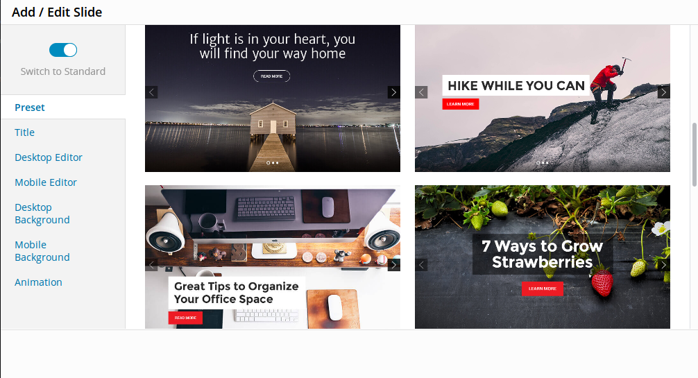
3. (Optional) You can choose your preset, to make the job easier. There are 12 beautifuly handcrafted presets avialable to choose.
4. Go to Desktop Editor. In here, you will presented by easy drag-n-drop layer editor. In this editor, you can choose to add image, text, code, video or button. This editor is presenting desktop slider (Laptop & PC), so in this editor you create slider for desktop view. Let me explain to the options avialable :
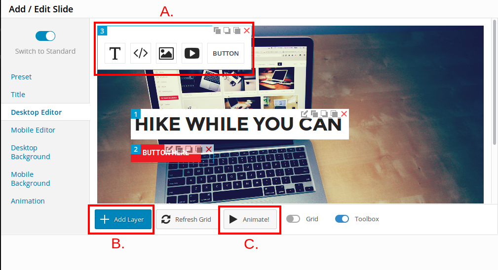
- A. The toolbox. Here you can choose what content you want to add to slider (image, text, code, video or button).
- B. Add more layer to your slider
- C. Preview the animation of your slider
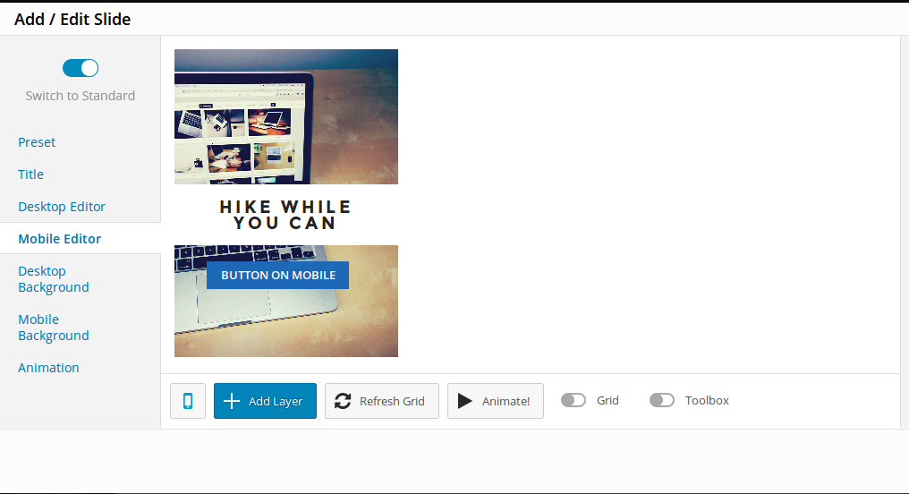
5. Now, after you finished with the desktop view, go to setup the mobile view. Go to Mobile editor :
Baca Juga
Basically, the mobile editor is just like desktop editor, only with smaller resolution. In the example above, the button is different with desktop editor (desktop editor is red button). The blue button only shown if user using mobile to access your website. So, yes you can create different layour and layer based on desktop or mobile, to maximize user expirence.
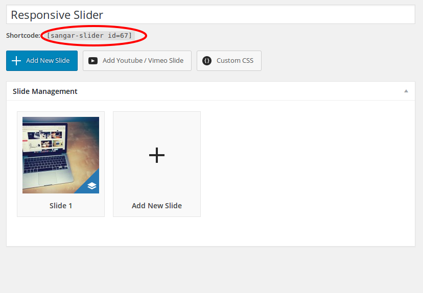
6. The Shortcode. After you finished with desktop and mobile editor, don’t forget to save your works. Copy the given shortcode to pages, posts or even page template to see your slider in action :
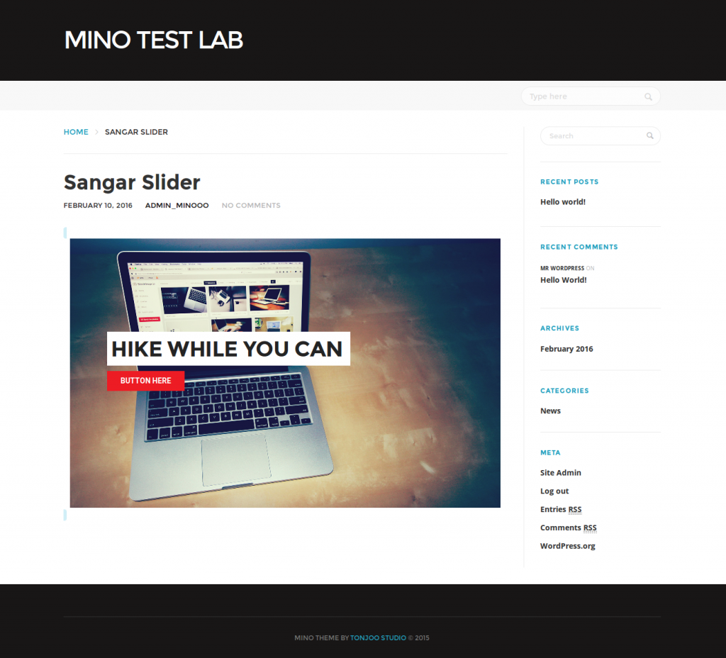
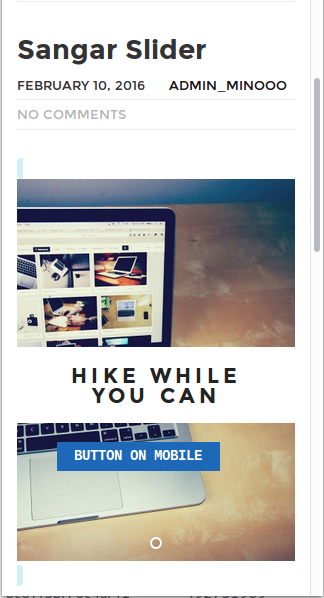
7. Demo. Now see your slider in desktop and mobile (You can minimzie your web browser to simulate mobile browser). And this is what you should get :
In normal browser/desktop, pay attention to red button :
Now minimize the web browser, again… Pay attention to button, it’s blue now :
Congratulations! You have managed to make different slider on Mobile devices. FYI: Sangar Slider is responsive wordpress slider with smooth animation, touch and swipe gesture support, modern, and easy to use. Packed with premium skins and template, and also easy to create your very own custom templates for your slider.
Last Updated on Maret 22, 2016 by Udhi Sapto Vilanata

Advertisements