Gutenberg Tutorial (Part 5): How to Create Slider

Advertisements
We will demonstrate how to create slider in WordPress using only the accessible block editor in this fifth edition of the Gutenberg WordPress series. However, it is assumed that you followed the prior tutorial on making the Footer successfully.
A slider is a website feature used to showcase multiple images or text with transition effects. It can be manually navigated or set to slide automatically.
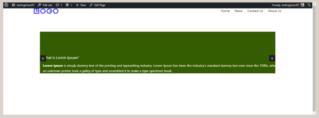
The term Slider is also commonly known as a Carousel. The end result of creating a slider will resemble the image below:
The final result of creating a Slider or Carousel in WordPress using Gutenberg.
Advertisements
How to Create Slider on WordPress using Gutenberg
To create a slider in WordPress using the Gutenberg editor, you will need to follow three basic steps, which involve (1) creating the heading and paragraph, (2) setting the background and color, and (3) adjusting the padding.
Step 1: Creating Title and Text for Carousel/Slider
To begin, we will establish the structure of the Slider or Carousel and then add the appropriate title and text.
To accomplish this, we will employ various blocks available in Gutenberg and Gutentor, such as the Carousel block, Container/Cover block, Spacer block, Heading block, and Paragraph block.
Here are the steps to create the title and text within the Slider:
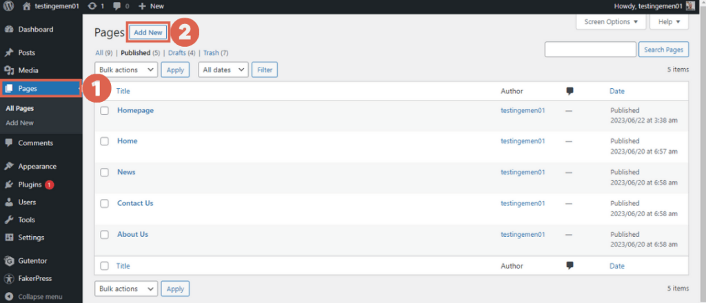
- Navigate to the WP Admin page and select the Pages menu on the left sidebar, then click on Add New.
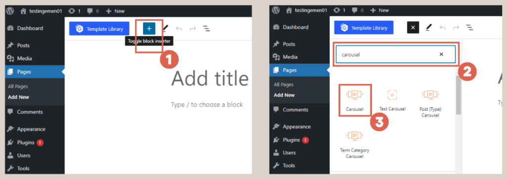
- Click [+] to add a block > type carousel in the search box > select the Carousel block. The Carousel block will serve as the slider on the website.
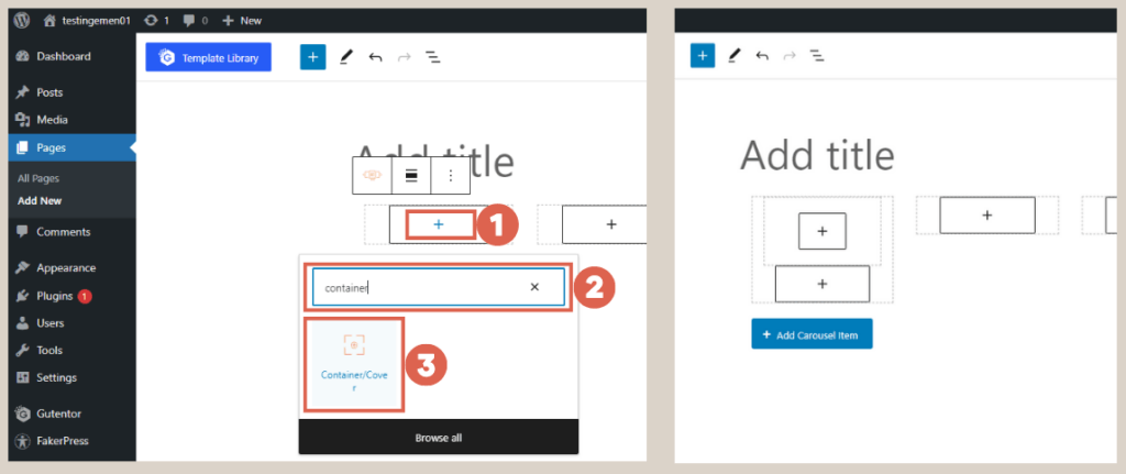
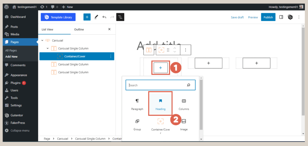
- Within the carousel block, click [+] to add another block > type container in the search box and select the Container/Cover block. This block facilitates the grouping and layout arrangement of other blocks within the Slider.
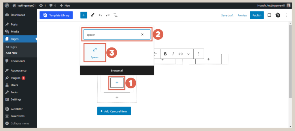
- Inside the container block, click [+] to add a Spacer block. This will create visual spacing within the Slider.
- Still within the container block, click [+] to add a Heading block, which will function as the title for the slider.
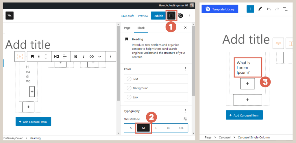
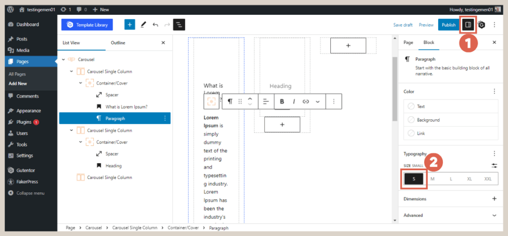
- Customize the Heading by clicking on the Settings at the top right corner > under the Typography section, select Size Medium (M) to adjust the heading size. Then, input the desired title text.
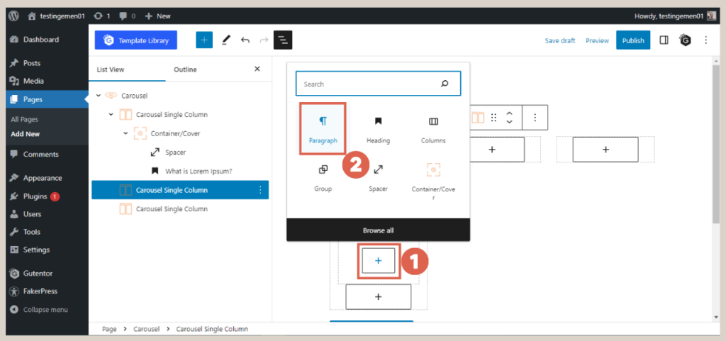
- Continuing in the same container block, click [+] below the Heading and select the Paragraph block. This block will serve as the text below the Heading.
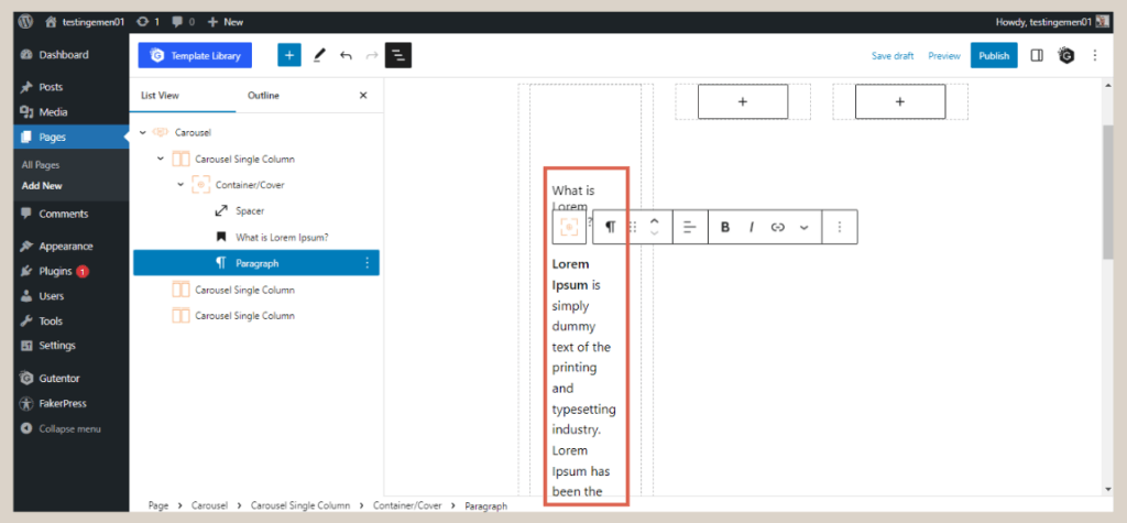
- Fill in the paragraph with the relevant content.
- Adjust the paragraph size by clicking on Settings > under the Typography section, select the Small (S) size.
- Repeat steps 3 to 9 for the remaining two Carousel Single Column blocks.
At this stage, the Slider may appear very basic. Therefore, it is essential to refine the appearance and apply appropriate colors to each element.
Advertisements
Step 2: Customizing Slider Colors and Size
With the content successfully added to the slider, it’s time to enhance its appearance by incorporating background colors and text colors.
Additionally, you’ll also need to adjust the size of the slider for optimal display. Follow these steps to achieve it:
Baca Juga
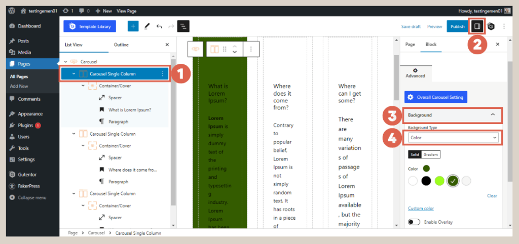
- Click on the first Carousel Single Column block > select Settings in the top right corner > under Background, choose Color and select your preferred color. Repeat the same process for the other Carousel Single Column blocks.
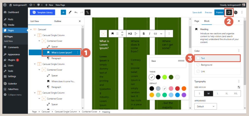
- To change the text color, click on the text blocks such as Heading and Paragraph > then select Settings > under the Color section > choose Text and pick the desired color. Repeat the same process for other text elements.
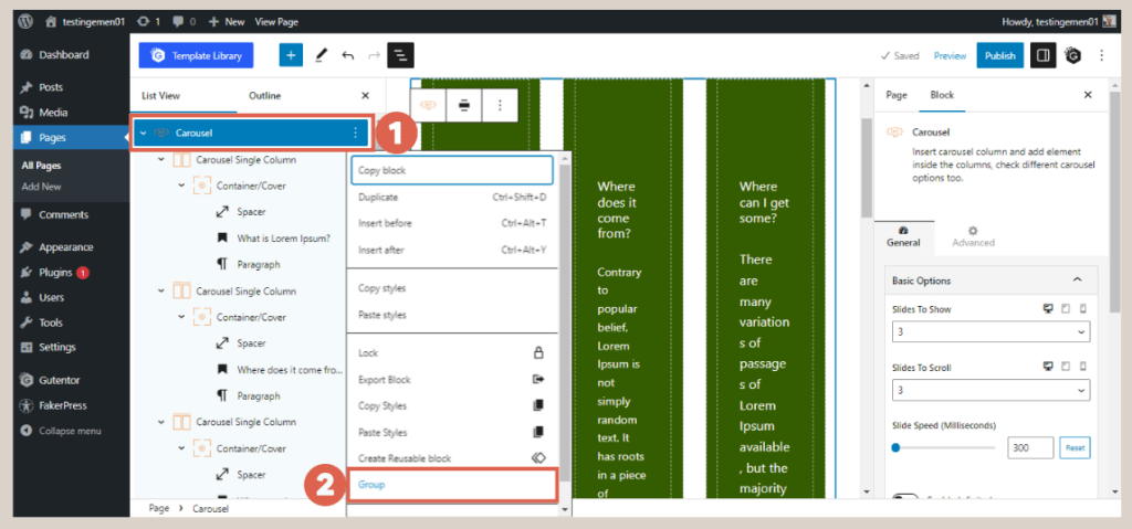
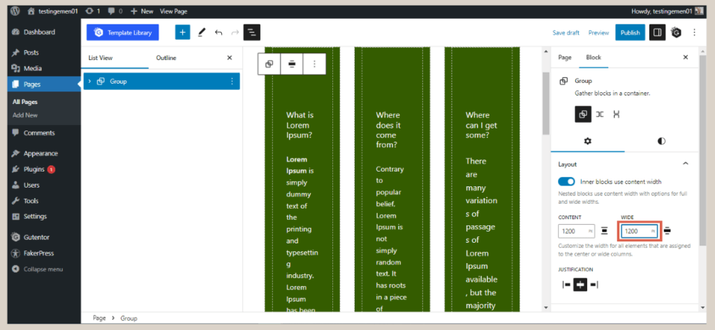
- Once you’ve completed the above steps, open the List View and click on the Carousel > click on the three dots in the Carousel > select the Group option to consolidate all elements within the Carousel.
- In the Settings section, adjust the width size of the slider to 1200 for a consistent appearance.
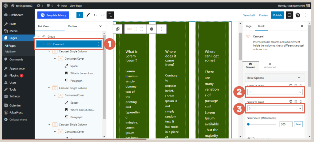
- Click on the Carousel again, and in the Settings section, navigate to Basic Options > change Slide To Show to 1 > change Slides To Scroll to 1.
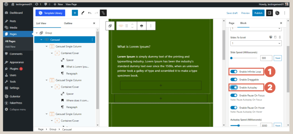
- Scroll down and ensure that the Enable Infinite Loop and Enable Autoplay toggles are activated.
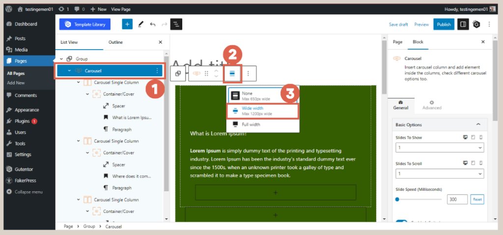
- Click on the Carousel again and on the toolbar above it, change its size to Wide width.
- Done! The Slider you created in Gutenberg WordPress will now have the desired appearance as shown below.
As you can see, the slider is already functional. However, the text inside the slider may require some adjustments. To achieve this, you can modify the padding settings.
Step 3: Fine-Tuning Slider Padding
Padding plays a crucial role in creating spacing between the elements within a website, enhancing overall organization and aesthetics. Let’s adjust the padding of the slider to achieve a more polished appearance:
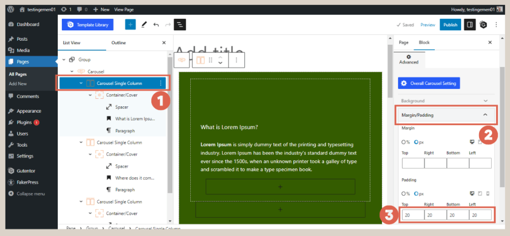
- Open the List view and select the Carousel Single Column block.
- Access Settings, then click on Margin/Padding > fill in the Padding section with your desired size. For instance, we are using a size of 20 for Top, Right, Bottom, and Left.
- Repeat the same process for the remaining Carousel Single Columns.
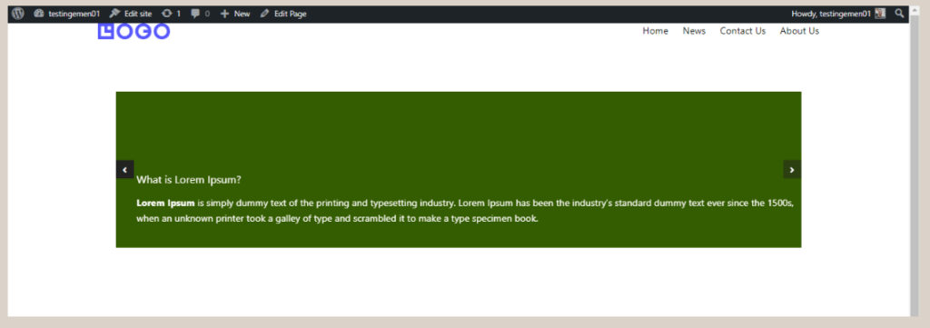
Upon completing the steps above, the final output of this slider will resemble the image below:

The final result of creating a Slider or Carousel in WordPress using Gutenberg.
Advertisements
Manage to Create Slider on WordPress using Gutenberg?
That wraps up the tutorial on creating a slider in WordPress with the Gutenberg editor. The next phase in building a simple website involves crafting a partner logo section.
Nevertheless, if you seek a highly professional website, it is advisable to delegate the development to a proficient service provider such as Tonjoo. By doing so, you can save time and ensure a superior level of professionalism.
Tonjoo holds substantial experience in developing websites for esteemed clients like Astra Isuzu, Futureskills, and Rey. If you wish to create a similar website, don’t hesitate to contact us via Tonjoo’s provided contact information.
Last Updated on July 18, 2024 by Tonjoostudio Team
Advertisements
